Introduction
“The twin bubbles in U.S. stocks & housing are set to create a recession and crisis that will be a hybrid of the 2001 bear market and the 2008 financial meltdown—combining the worst elements of both.…as I’ll illustrate in the charts below” says Jesse Colombo in his recent post which has been edited and abridged as follows for a faster and easy read.
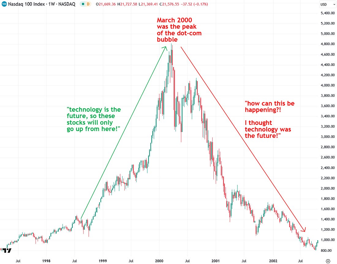
The Dot-Com Bubble – A Revisit
“…Revisiting the dot-com bubble of the late 1990s is essential to understanding our current situation. The dot-com bubble was a massive stock market frenzy centered around internet-related companies, fueled by the belief that investing in this revolutionary technology was a guaranteed win…While the internet was the future, stock valuations soared far beyond reality. The bubble ultimately burst in spectacular fashion between 2000 and 2003, triggering a recession and a prolonged slump in the tech sector.
 |
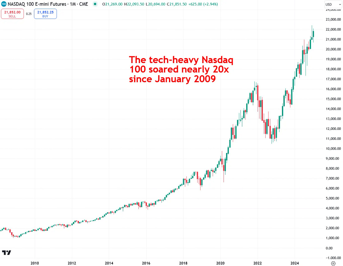
Today’s Tech Stock Boom
The tech-heavy Nasdaq 100 has skyrocketed nearly 20x over the past decade and a half, fueled by excitement and hype surrounding technology once again. This time, the frenzy is centered around social media, smartphones, mobile apps, cloud computing, e-commerce, electric vehicles, and artificial intelligence, to name a few…While these technologies are here to stay—just as the internet was during the dot-com bubble—today’s market darlings like Amazon, Nvidia, Tesla, and Palantir have surged far beyond their fundamentals, much like tech stocks in 1999. Once again, we’ve fallen into the same trap, convinced that this time is different—but history says otherwise. It never repeats exactly, but it certainly rhymes.
 |
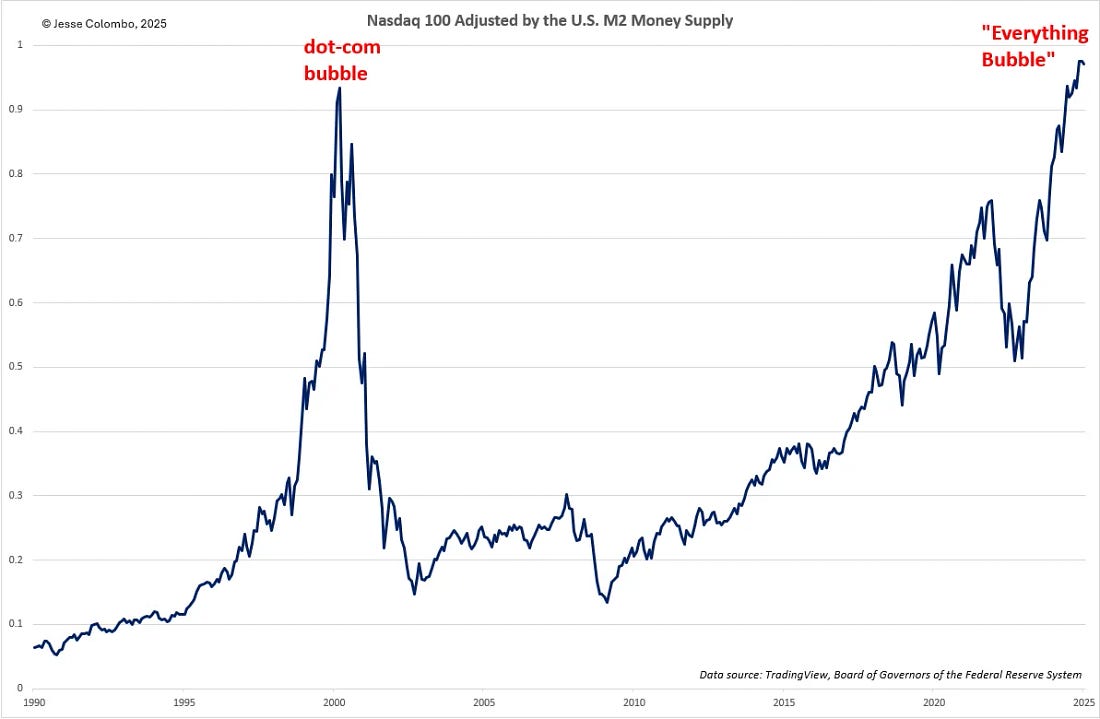
I can prove beyond a reasonable doubt that today’s tech stock boom is at least as inflated—if not more dangerous—than the dot-com bubble, using multiple valuation indicators. Let’s start with the first: the Nasdaq 100 adjusted for the U.S. M2 money supply, which represents the total amount of U.S. dollars in circulation.
The Nasdaq 100 Adjusted For the U.S. M2 Money Supply
When an asset, such as a stock index or gold, rises at the same pace or slower than the money supply, its growth is generally sustainable. However, when it surges far beyond the rate of monetary expansion, it usually signals a dangerous bubble. This is exactly what happened with tech stocks and the Nasdaq 100 in 1999—and it’s happening again today. Unfortunately, history proves that bubbles like this don’t end well. Just as in the early 2000s, this one is going to unravel in a devastating bear market.
 |
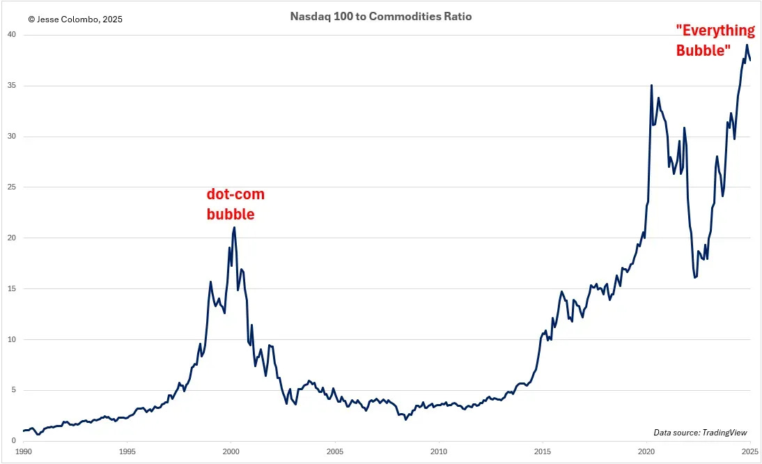
If the Nasdaq 100 adjusted for the U.S. M2 money supply wasn’t enough to convince you that we’re in a massive tech stock bubble, let’s examine another key valuation metric for further confirmation: The Nasdaq 100 to commodities ratio—or the Nasdaq 100 divided by the S&P GSCI commodities index.
The Nasdaq 100-to-Commodities Ratio
Commodities offer a valuable comparison because they are inflation-sensitive and are essential resources—such as crude oil, wheat, corn, cotton, and copper—that are fundamental to human survival and economic activity. This makes them a strong benchmark for assessing whether tech stocks have become overvalued. This ratio clearly reveals that tech stocks, as represented by the Nasdaq 100, are deep in bubble territory—even more extreme than during the dot-com era and, just like last time, this speculative mania will end in a painful collapse.
 |
The Total U.S. Stock Market Capitalization-to-GDP Ratio
If you’re still not convinced we’re in a massive stock market bubble, consider billionaire investor Warren Buffett’s favorite market indicator: the total U.S. stock market capitalization-to-GDP ratio. This metric, a key gauge of market valuation, currently stands at 206 which is 142% above its long-term average of 85, dating back to 1971. This level even surpasses the peak of the late-1990s dot-com bubble. Buffett himself has warned that when this ratio nears 200%, investors are “playing with fire”—and that’s exactly what’s happening right now.
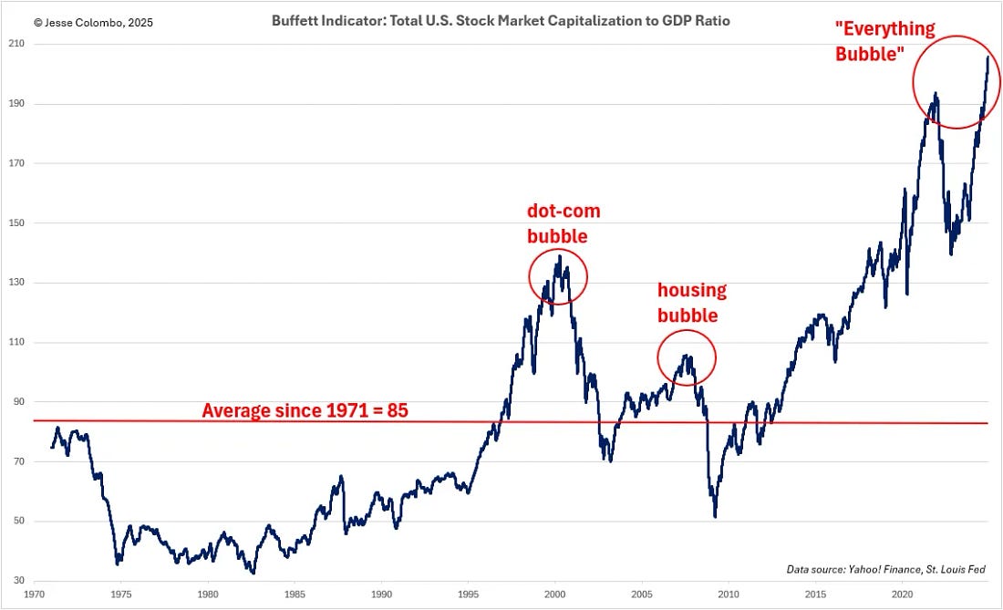 |
The Price-to-Sales (P/S) Ratio
So far, I’ve focused on the Nasdaq 100, which is primarily a tech-oriented index, but the S&P 500—a broader benchmark of the 500 largest publicly traded companies—also has significant tech exposure. One key valuation metric, the price-to-sales (P/S) ratio, which compares the S&P 500’s price to the total revenue of its constituent companies, further confirms that U.S. stocks are even more inflated than they were during the dot-com bubble.
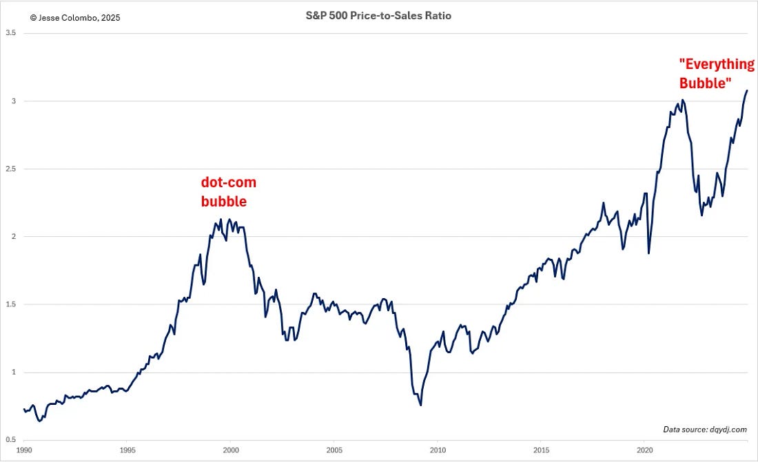 |
While I’ve already highlighted several valuation metrics that clearly demonstrate the extreme overvaluation of the U.S. stock market, there’s plenty more to consider. In fact, 19 out of 20 key valuation metrics confirm that the S&P 500 is wildly overvalued and dangerously exposed to a violent unwinding of the excesses that have accumulated over the past 16 years.
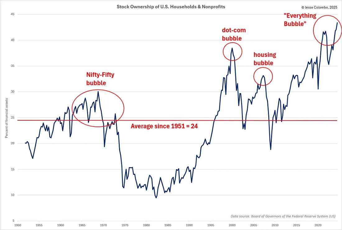
The “Dumb” Money
Unlike the “smart money” investors who have been aggressively selling their stocks, the “dumb money”—retail investors who are historically wrong at major market turning points—are all-in. Mom-and-pop investors currently have a record stock allocation of 43.38% of their total assets, fully loaded with equities at dangerously high valuations. It’s like buying a Honda Civic for $100,000, convinced that prices can only go up forever. Unfortunately, they’re in for a rude awakening.
 |
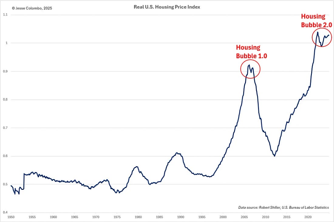
As I explained at the start of this report, we’re not just dealing with a stock market bubble—we’re also experiencing a massive housing bubble, making this a dangerous combination of 1999 and 2007 all over again. Inflation-adjusted U.S. housing prices are now even higher than they were during the mid-2000s housing bubble that led to the 2008 crash (remember The Big Short? It’s happening again).
The Housing Bubble
Housing has become so overpriced that to afford the median-priced home of $433,100, Americans now need an annual income of $166,600—yet the median household earns just $78,538, as Fortune Magazine recently reported. This kind of imbalance cannot last, and history tells us exactly how it ends: a housing market crash.
 |
There are already clear signs that the housing bubble is on the verge of bursting. Home sales in 2024 have fallen to their lowest levels since 1995 for the second consecutive year, driven by extreme unaffordability. At the same time, U.S. homebuilding stocks appear to have peaked and are now rolling over—a pattern strikingly similar to the early stages of the 2008 housing crash. I remember it vividly, and history is repeating itself once again.
 |
The U.S. economy is heavily dependent on the housing market, which has historically led the economy both into and out of recessions. Given the sharp slowdown in housing activity, there is a high likelihood that a recession has already begun, and this is now reflected in multiple economic indicators, including the New York Fed Recession Probability Model.
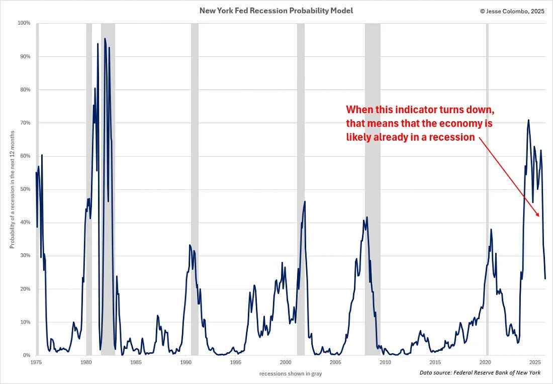
The New York Fed Recession Probability Model
Historically, when this indicator rises, it signals an increasing probability of a recession. However, when it begins to decline, it usually means the economy is already in a recession. Over the past year, this model has been trending downward, strongly suggesting that the U.S. has already entered a recession—one that was set in motion long before President Trump took office, leaving him with little to no power to stop or prevent it.
 |
Precious Metals
Now that we’ve covered the two major bubbles—stocks and housing—that have been inflating and are poised to trigger a powerful recession when they burst, let’s examine what this means for precious metals and their investors. Stocks and precious metals compete for capital, and during massive stock market bubbles—such as in the late 1990s and today—investment flows overwhelmingly into equities, draining capital from gold and silver. However, when these bubbles inevitably collapse, that capital typically shifts into precious metals, driving their prices sky-high.
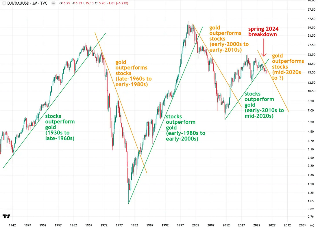
The Dow-to-Gold Ratio
As illustrated by the Dow-to-Gold ratio chart below, these capital rotation events occur periodically and are signaled by breaks of major trendlines. A break below an uptrend line signals that gold is poised to outperform stocks, while a break above a downtrend line indicates the opposite. Historically, major secular bull markets in both gold and equities over the past century have been preceded by such trendline breaks.
What’s particularly significant is that in spring 2024, the Dow-to-Gold ratio broke below its uptrend line. This means that a capital rotation from stocks to gold is already underway—and when the current stock market bubble inevitably bursts, this rotation will only accelerate.
 |
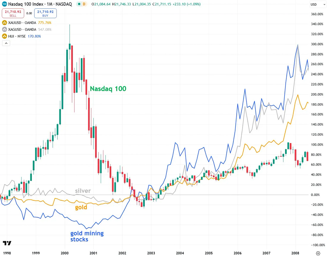
The Dot-Com/Nasdaq Bubble-to-Gold, Silver & Gold Mining Stocks Ratio
The chart below illustrates the dot-com/Nasdaq bubble of the late-1990s, which I’ve referenced throughout this report, and compares it to gold, silver, and gold mining stocks. As shown, when the Nasdaq bubble burst in the late 1900s, a massive outflow of capital sent gold soaring threefold, silver rising more than fourfold, and mining stocks skyrocketing tenfold over the next seven years. I see this as a roadmap for what’s likely to happen when today’s massive tech stock bubble inevitably collapses—especially since precious metals investments have remained depressed for years, much like they did in the 1990s before their explosive bull market.
 |
Conclusion
…The U.S. is not facing just one, but two massive bubbles—stocks and housing—and their collapse will be a hybrid of the early 2000s dot-com bust and the 2008 housing crash, making it even more severe than either one alone.
While this spells trouble for naïve housing and tech stock investors who believe their favorite assets will keep rising indefinitely, it presents a huge opportunity for contrarian precious metals investors. Those willing to stand apart from the crowd and think critically can capitalize on one of the few remaining undervalued and overlooked sectors—before the rest of the world wakes up to it.